03 / Design system · Banking · 2026
NATIVO / BCI
Turning repeated decisions into shared rules.
From conversations with the bank’s teams and a global audit of existing libraries to building and reviewing components for Nativo, BCI’s cross-product design system.
Outcome: Built and reviewed in Figma


- Role
- Product Designer · Nativo DS team
- Project
- Discovery · audit · components
- My focus
- Building and reviewing components in Figma
- Year
- 2026
Featured case
The challenge
The challenge: Aligning libraries that solved the same problems differently
Several libraries coexisted across products: App Kit and Pagos SDK for app; Web Kit, Wholesale, Pyme and the web design system for payments products. They addressed similar needs with different names, anatomy, configurations and levels of documentation.
Aligning them meant identifying what could be shared and what reflected different behavior. Each additional variant also introduced construction and maintenance decisions.
My contribution
My contribution: From discovery to building components
I contributed to the discovery with the bank’s teams and to the visual audit of the libraries. After that, my role focused on building and reviewing components in Figma: interpreting the team’s definitions, applying agreements to component anatomy and properties, and checking consistency across states.
The overall architecture, the token model and brand decisions were part of the team’s shared framework. They are not presented as individual decisions.
Value proposition
Value proposition: Shared criteria instead of parallel solutions
Connect bank objectives, team needs and existing tools through shared criteria for a cross-product design system: a foundation the team can review and reuse.
Decisions and evidence
Decisions and evidence: From the audit to decisions visible in the components
Discovery and global audit
The work began with conversations with teams to understand the bank’s goals, the areas involved and the scope of each design practice. Before building components, we aligned on the system that needed to exist.
01 · Business context
Goals, products and the expected scope of the new system.
02 · Teams and tools
Design systems, UI kits and product files used by each team.
03 · Inventory and overlap
Duplicated components, different names and equivalent or specific uses.
04 · Shared criteria
What to unify, what needed to remain distinct and what required validation.
What was duplicated
- The same kind of component had different names across libraries: Snackbar and Toast, Alert and Banner alert, or several versions of Stepper.
- The same component was classified under different families: Stepper, for example, was navigation in one library and feedback in another.
- Functional and technical documentation was uneven: complete, incomplete, outdated or unavailable, depending on the library.
- In tokens, the same value could exist in several places with no alias chain connecting them.
How the team defined cross-product criteria
- A shared inventory by functional family (Actions, Forms & Inputs, Navigation, Feedback & Status and Data Display & Content), usage, platform and documentation status.
- A comparison of purpose, anatomy, states, tokens, accessibility and usage context to separate true duplication from necessary variation.
- A layered token model—reference, brand, system and component, chained in that order—with questions to place each value: does it change by brand, theme or size? Is it a primitive value?
- A check before creating a token: whether an equivalent already existed and whether the new one added a real difference in state, variant or brand.
Reconstructed evidence · ecosystem view
- Products / areas
- App Kit · Web Kit · Wholesale · Pyme · Payments
- Assets reviewed
- Components · UI kits · styles · tokens · documentation
- Audit questions
- Purpose · duplication · utility · dependency · maintenance
- Output
- Shared inventory + alignment criteria + justified exceptions
The audit wasn’t about making things look the same: it turned scattered findings into rules that could hold across teams.
Rules were part of the design, too
Before building: define the boundaries
The team had documented purpose, anatomy, naming, token usage and accessibility. The framework distinguished changes by brand, theme and size, and helped decide what a component should inherit, what could be configured and when a difference justified a new variant.
During the work: apply evolving definitions
Reviews refined those rules: properties were separated, dependencies held up completion and some agreements needed another review. The decision log distinguished current, under-review and discarded decisions.
Three decisions you can see in the components
01 · Tabs · Flexibility within a shared structure
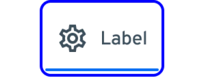
The team agreed on equal-width tabs at a single 48 px height, dropping the Compact size. Flexibility remained in the number of tabs and optional elements. When building Tabs, I kept State and Selected separate: a selected tab can also receive focus.



02 · TextInput · Separate state from content
The team recorded a specific decision: separate State from Content to avoid names such as “enabled filled” or “error empty.” The state keeps its meaning with or without content. The built component reflects this in its Size, State and Content properties; the label and help or error text belong to FormField.



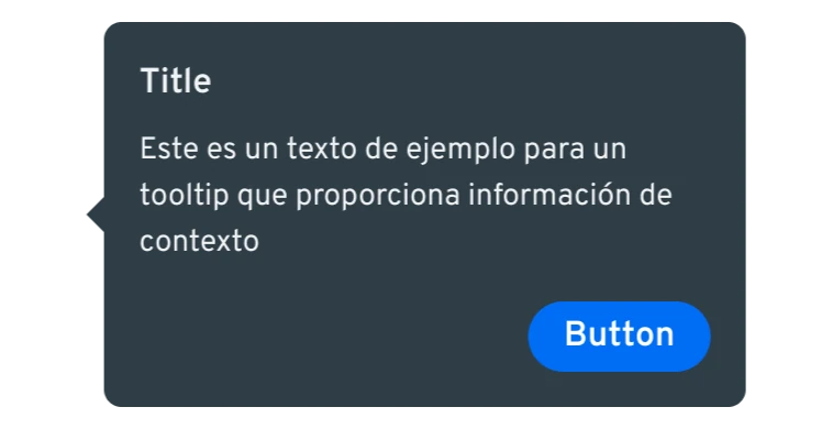
03 · Tooltip · Change the configuration, keep the anatomy
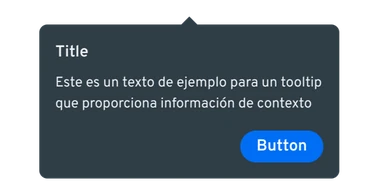
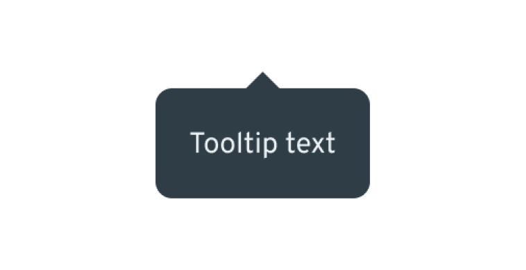
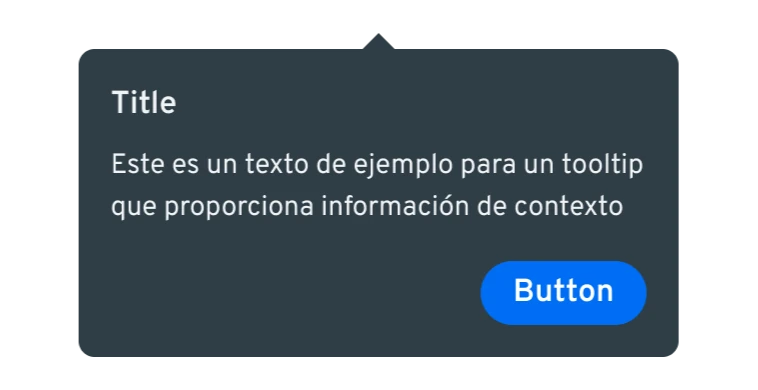
Tooltip needed to support brief help as well as content with a title and action. The built component distinguishes Default and Rich, with four placements and optional title, action and arrow properties. Separating Container from Arrow lets placement change without redefining the content.
Built, reviewed and validated are different states
The team’s process specified that a component had to be presented and validated before it could be considered complete. Schedules tracked improvements, dependencies and further review rounds.
The documentation also separated automated checks from human review. Focus order, keyboard navigation and screen readers require testing actual behavior: a Focus state drawn in Figma defines a visual treatment; functional validation continues in implementation.
Impact and actual scope
Impact and actual scope: A foundation the team can review and reuse
Discovery and the global audit gave context to library alignment. My contribution took shape in components with consistent anatomy, explicit properties and distinct states: a reviewable foundation for further construction.
Learnings
Learnings: The cost of a decision appears when others use it
This project sharpened my attention to the consequences of each change: the exception it introduces, the components it affects and the people who will maintain it.
Building a system means making those dependencies explicit and preserving the reasoning behind the solution. I carry that into my product work.
What can’t be claimedwithout measurement
What can’t be claimed: Construction and review, not adoption
- The outcome is construction and review in Figma. There are no adoption, team efficiency or production performance metrics.
- The audit criteria and the token model were team work; some documents were still under review.
- A state drawn in Figma doesn’t prove functional accessibility: that validation happens in implementation.